Full-scale enterprise rebrand and identity architecture for a $30M+ SaaS platform.
Network Optix expanded from one product to three, Nx Witness, Nx EVOS, and Nx Go, on the same core technology, different markets. The job was rebuilding the brand system across all three without losing the recognition already built into Nx Witness, inside an industry where visual conservatism is the trust signal security buyers actually reward. Progress had to read as credible, not experimental.
Partnered directly with the CEO and VP of Product to define brand hierarchy across the portfolio, then shipped a formal brand manual and ran alignment sessions to hand off execution to product teams. The system helped position Network Optix for government-level evaluations in a $30M+ revenue year.
Logo & Marks
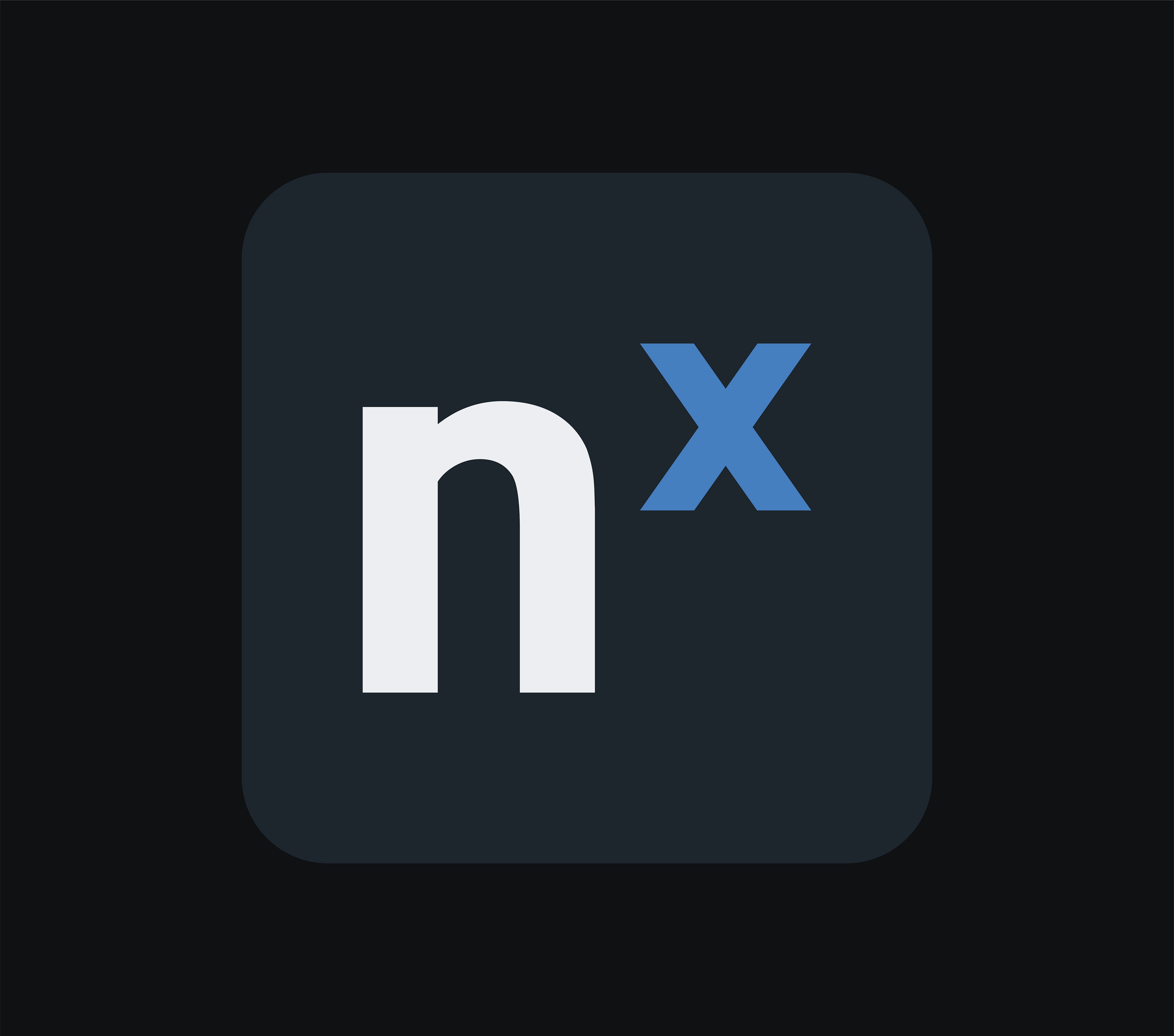
Nx Witness stayed blue, its existing equity was worth more than a fresh coat of paint. Grey went to EVOS, copper to Go. Each product got a non-typographic mark that had to work identically in print, in software, and live on a trade show floor.
Color System
One core palette, three assigned identities. Color logic embedded directly into product UX and UI, not just marketing collateral, so the brand distinction holds inside the software itself, not only on the outside of it.



Typography
The goal from the start was a geometric sans-serif, the kind of typeface built for wayfinding and signage, clean, legible at a glance, built to guide someone through a space rather than just look good on a page. That logic translates directly to enterprise software: the same clarity that gets someone through an airport terminal is what gets someone through a dense product interface. Barlow fit that brief, clean and neutral for UI, with a slightly more compact width and a touch more geometric character than a system default, enough personality to carry a logo lockup or a trade show banner without losing the legibility the whole system depends on. One typeface across the whole system, one consistent hierarchy across three products.

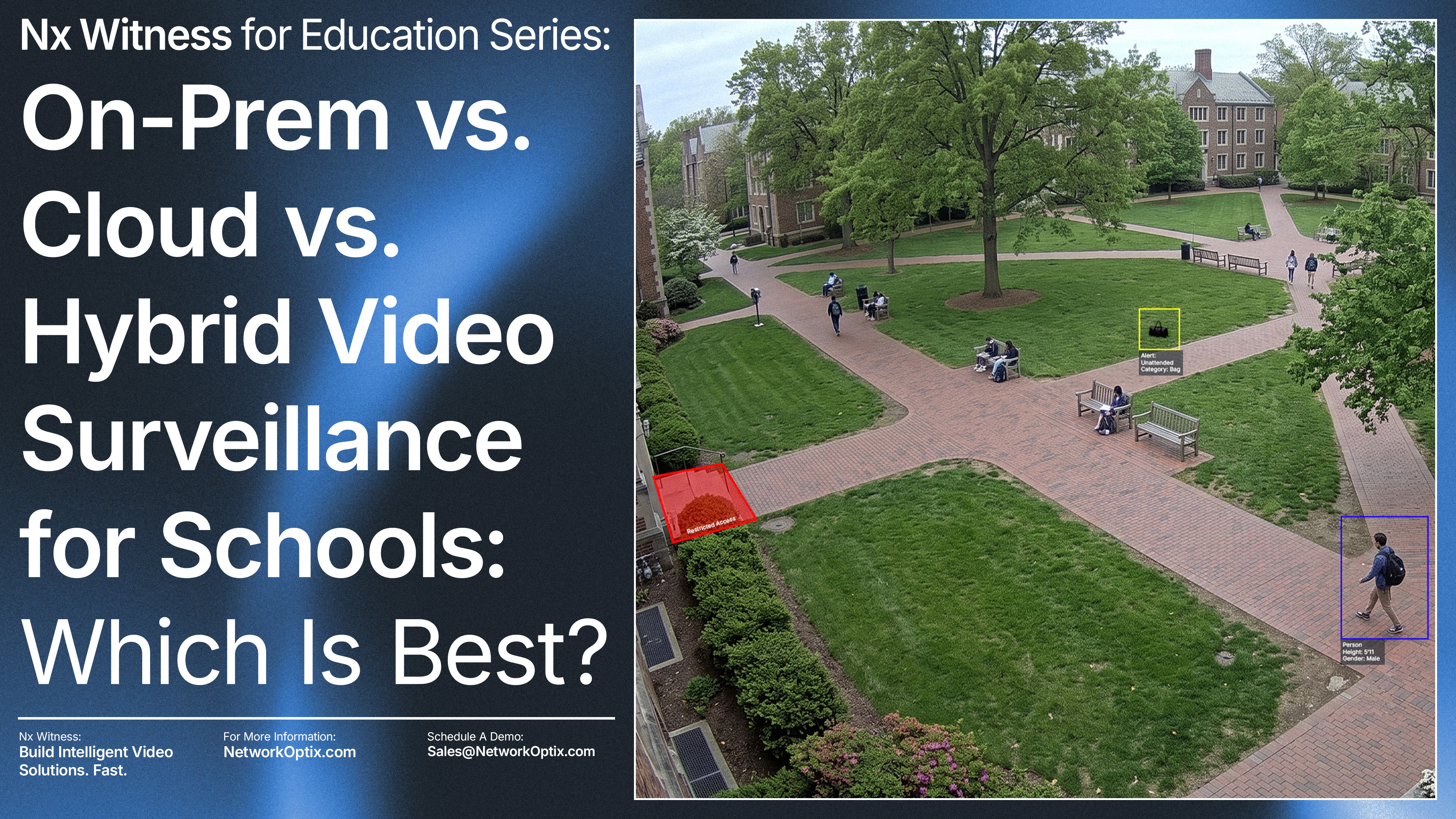
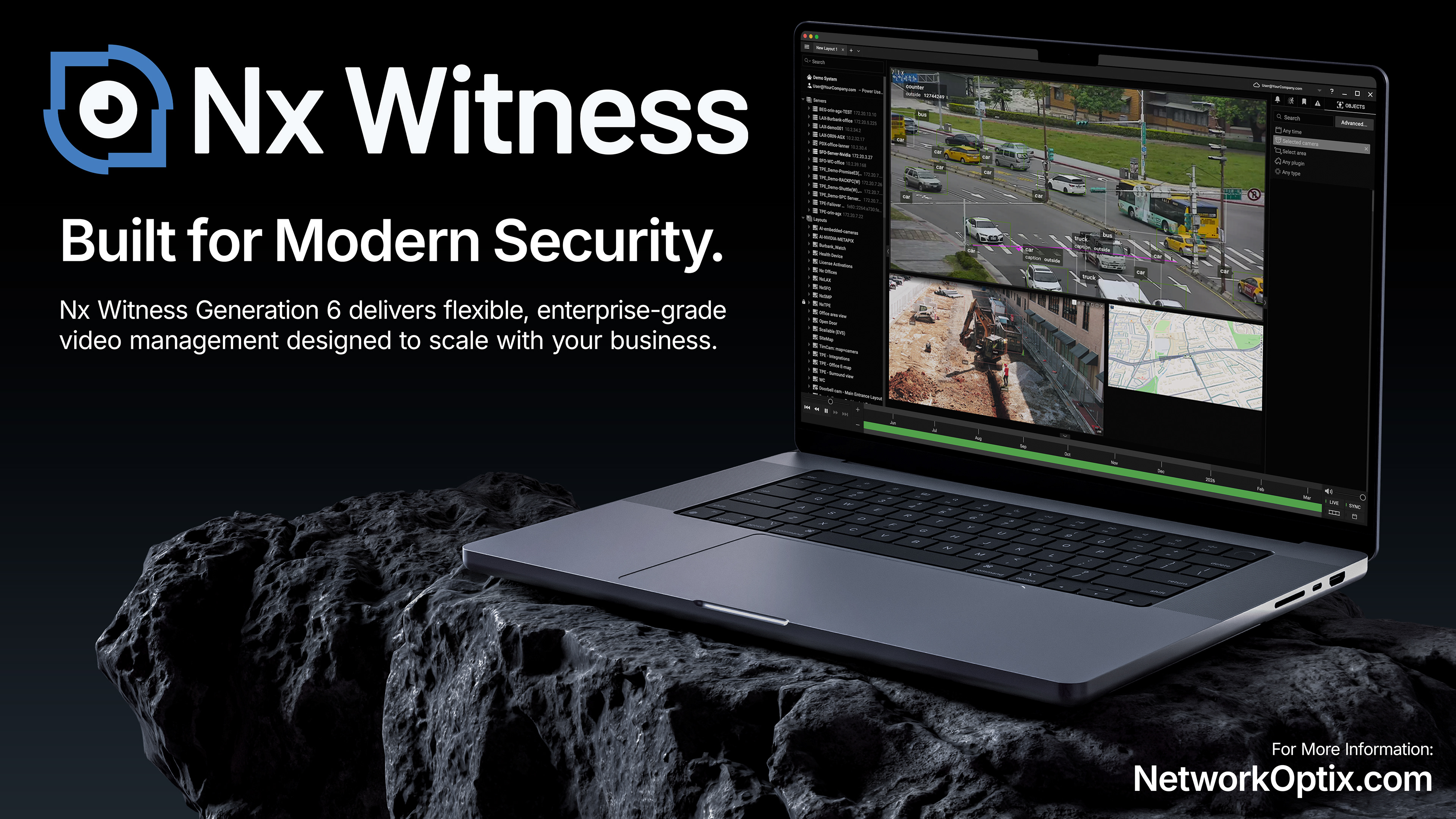
Blog Hero Images
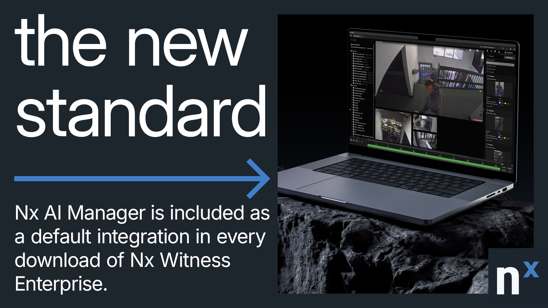
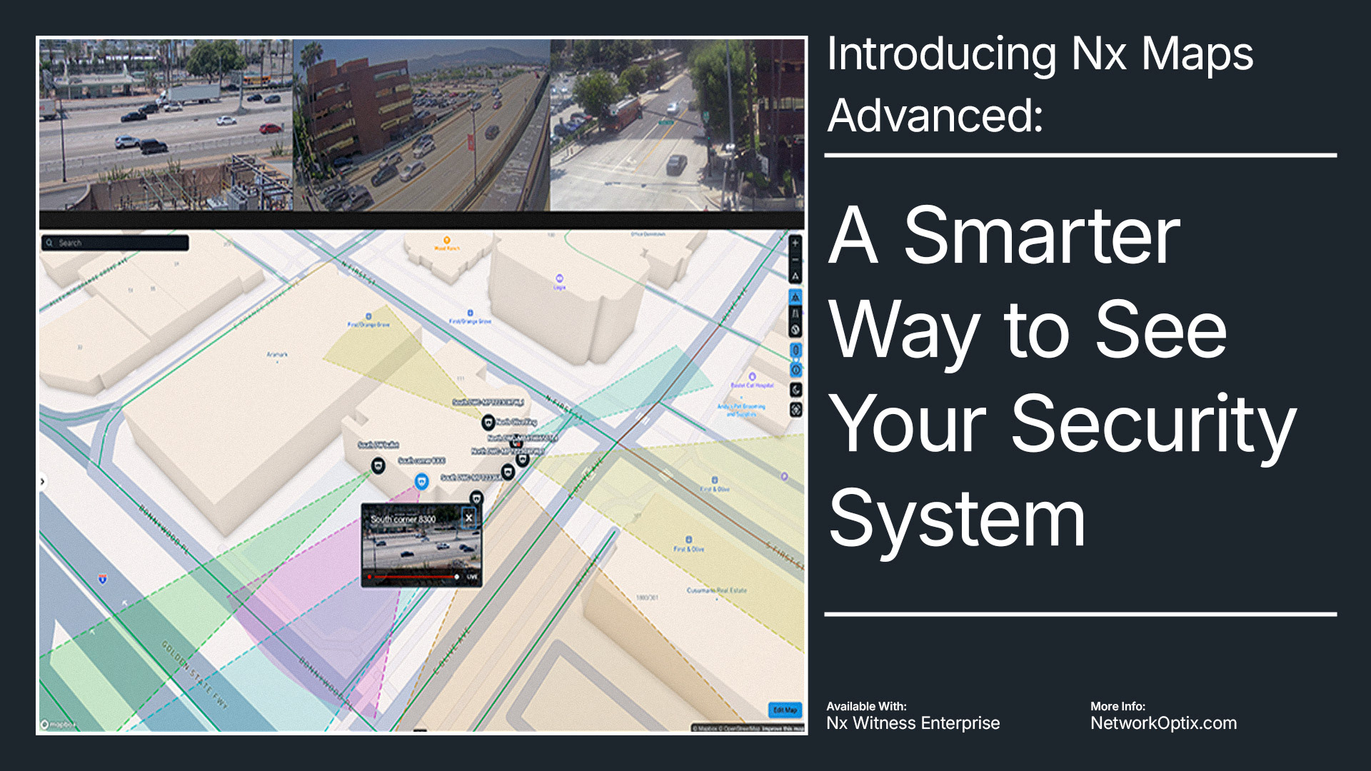
Editorial imagery built to carry the brand's visual logic into content marketing, consistent enough to read as Network Optix at a glance, flexible enough to cover a portfolio's worth of topics.
















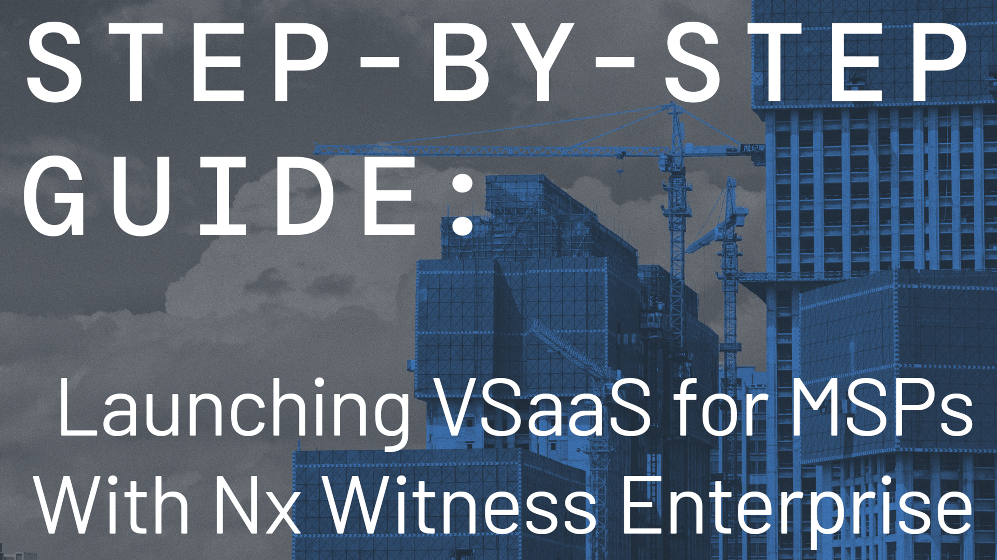




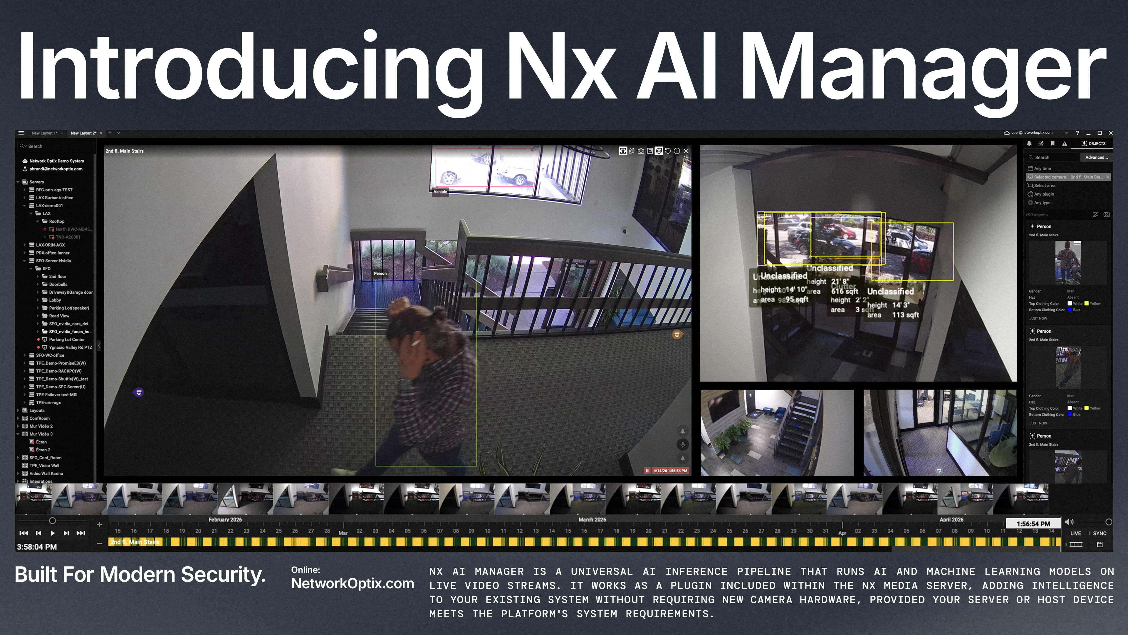
Video Thumbnails
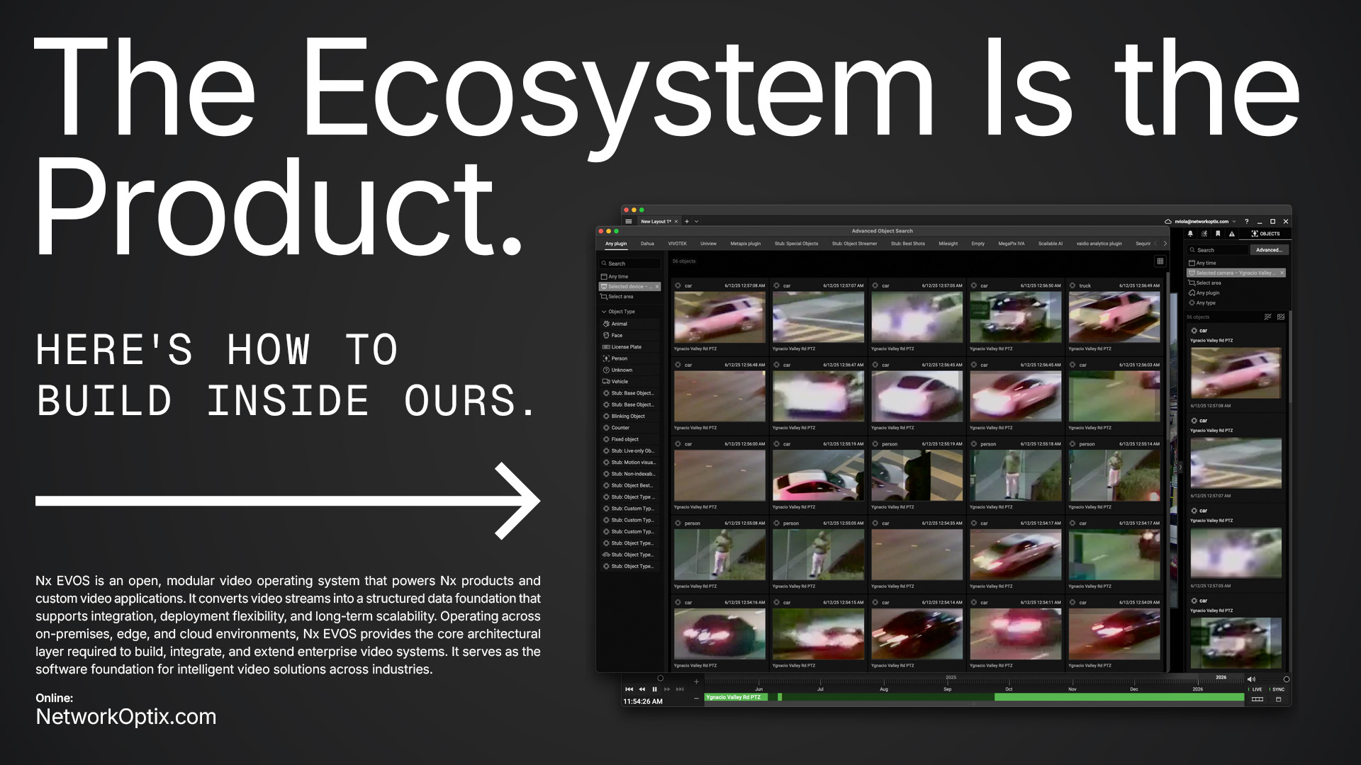
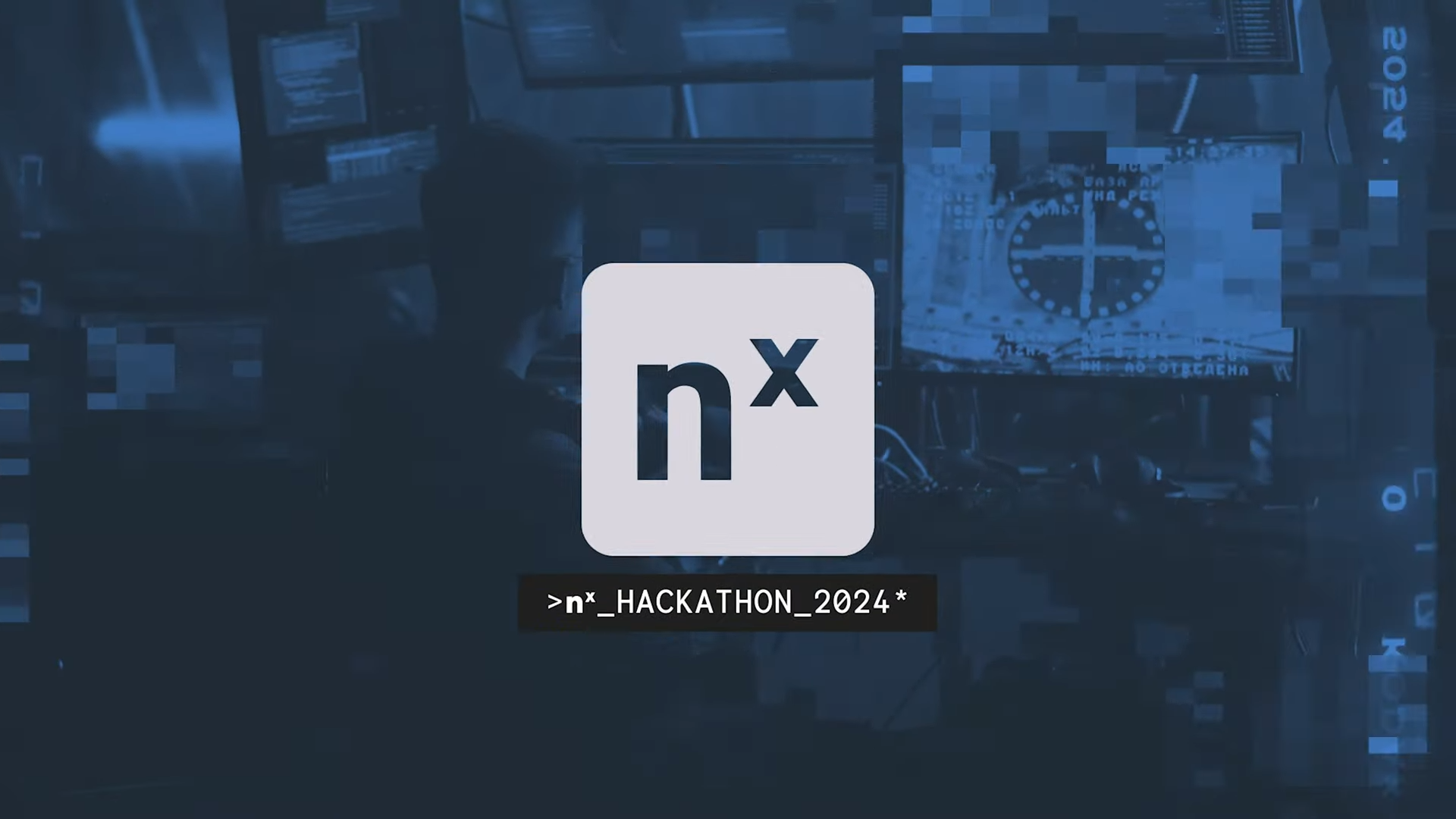
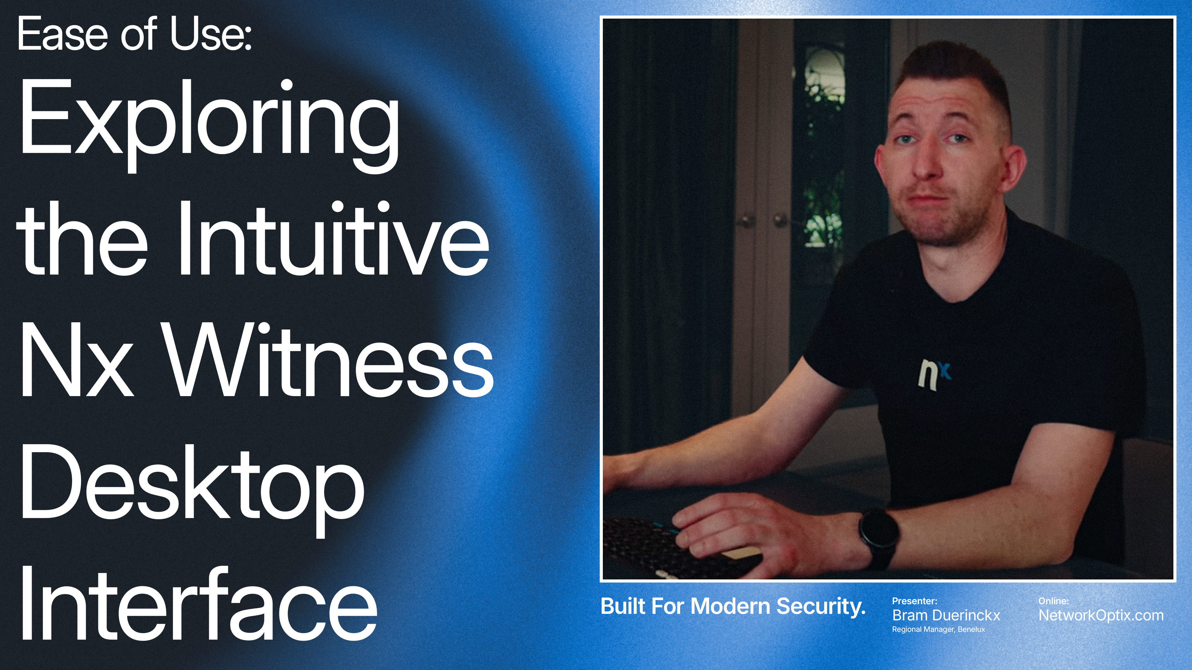
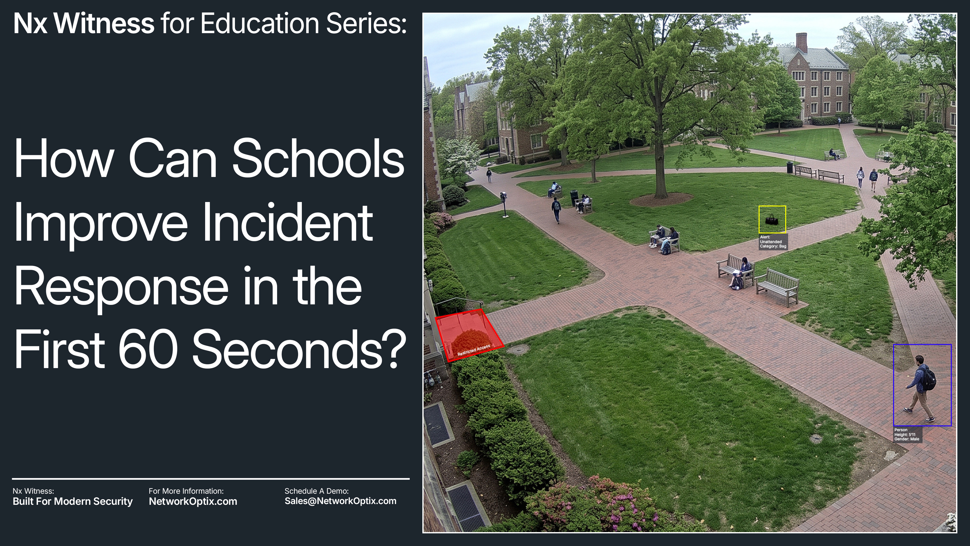
The same system extended to video, product demos, webinars, and educational content with different origins, all carrying the same visual identity by the time they land on YouTube.



A Note on the Actual Constraint
Security buyers aren't conservative by taste, they're conservative by infrastructure. A factory floor with miles of existing cabling and access points doesn't rip that out because a vendor's brand looks fresher this year, the switching cost is real, and so is the risk. A lot of the industry is also ex-military, people trained to value order and restraint as a professional discipline, not a personal style preference. Put those two things together and you get a buyer who wants to see progress, wants the product to feel current, but reads too much visual departure as a signal that the thing behind it might be unstable too.
That gave the rebrand a real bandwidth to work inside: enough visual confidence to read as forward-moving, never so much that it reads as unproven. Every decision in this system, the mark logic, the color assignment, the typeface, got weighed against that line. Not "does this look good," but "does this still look like something a buyer would trust to run their infrastructure."