Network Optix was transitioning from a single flagship product into a multi-product, multi-vertical platform. While Nx Witness had established recognition, the company was preparing to expand with Nx EVOS and Nx Go — each serving different use cases but originating from the same core technology.
The challenge wasn’t simply launching new products. The existing brand and product identity were no longer built for what the company was becoming. The visual language felt dated, and rapid software evolution made the platform feel closer to a new generation than a minor iteration. The primary risk was fragmentation. Without a cohesive system, each product and surface would begin to drift visually — creating confusion both internally and externally. At the same time, a complete reset risked erasing the familiarity and trust already associated with Nx Witness. The challenge was to evolve the brand without disruption — preserving recognition while building a system that could scale naturally as new products and verticals were introduced.
My Role
I worked directly with the CEO and VP of Product to define the boundaries and relationships between Network Optix’s expanding product portfolio — establishing clear distinctions between Nx Witness, Nx EVOS, and Nx Go while ensuring they read as a single, cohesive platform.
From there, I held end-to-end ownership of the brand system. I defined the visual language, established the governing rules, and made the core design decisions across touchpoints.
I partnered closely with UX/UI teams to extend the system into the software itself, providing color logic and brand guidance that product teams implemented directly. I also worked with the copy team to shape narrative language and clarify how each product fit within the broader ecosystem.
For roughly six months, this became my primary focus — strategy, research, alignment, design, and iteration in continuous cycles — with the goal of building a system that could be understood, adopted, and scaled without constant intervention.
The System
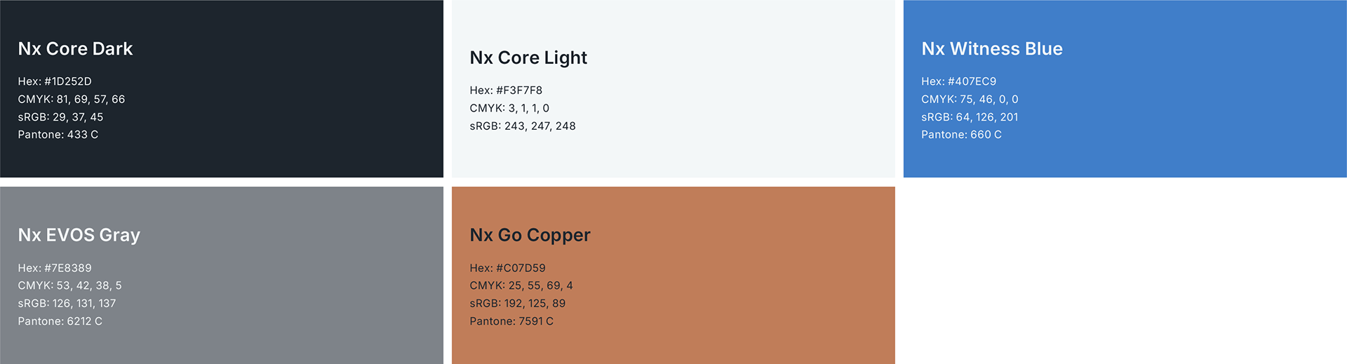
The foundation of the system was intentional constraint.
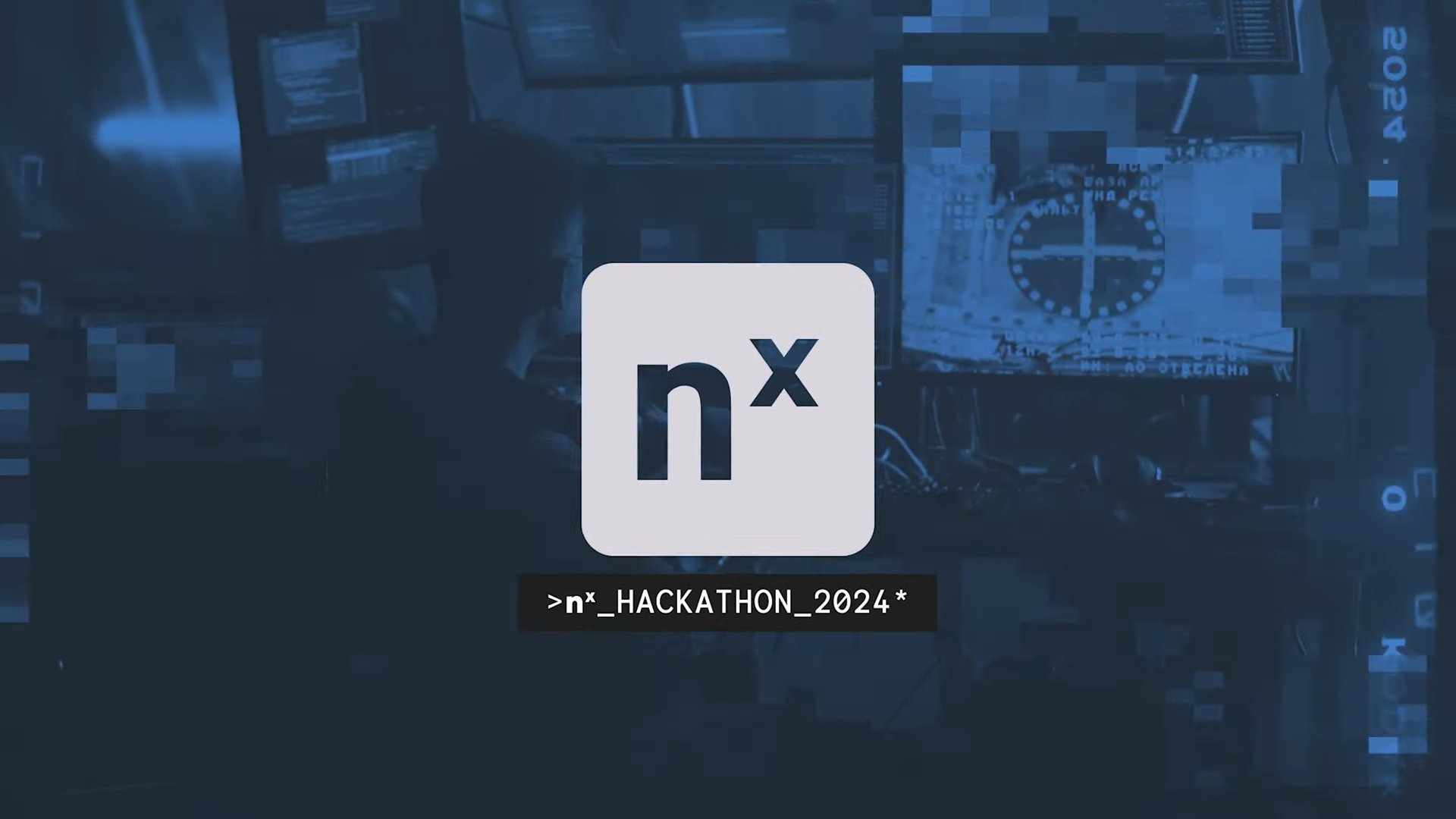
I established a shared core light and core dark foundation across all products, retained Nx Witness blue as a legacy anchor, and introduced a single defining color for each product vertical. This created immediate visual compartmentalization while ensuring every product remained recognizably Network Optix.
The logic was explicit and enforceable:
Nx Witness paired core light and dark with blue, Nx EVOS with gray, and Nx Go with copper. This structure applied consistently across software surfaces, print, digital, and live environments — removing subjectivity and reducing friction as the system scaled.
Nx Witness paired core light and dark with blue, Nx EVOS with gray, and Nx Go with copper. This structure applied consistently across software surfaces, print, digital, and live environments — removing subjectivity and reducing friction as the system scaled.
Iconography became a critical component of the system as well. Product marks needed to operate independently — not as typographic shortcuts or name-based ligatures — but as confident symbols that could stand on their own. Drawing from experience in fashion and music merchandising, the goal was to build recognizable forms that could exist beyond context and still be unmistakably tied to their product.
Together, these rules balanced familiarity with forward motion — allowing existing users to recognize Nx Witness instantly, while ensuring new products felt intentional, confident, and clearly related.
The Work
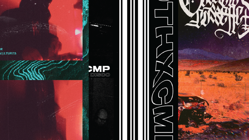
The work shown here reflects the system applied across a wide range of surfaces — product-adjacent visuals, brand marketing, events, and partner materials — all produced within a single, cohesive framework.
While the broader AI and technology space often rewards visual experimentation, the cybersecurity industry tends toward conservatism and familiarity. A key challenge was pushing the brand forward without undermining trust. The system was designed to be bold, confident, and visually distinctive, while maintaining credibility in a security-first environment.
Each execution demonstrates how consistent rules enable flexibility — allowing the brand to move quickly, adapt to different contexts, and stand apart in a crowded market without losing coherence.
Outcomes
Internally, the system gained immediate traction. Sales teams were energized by the new clarity and actively requested updated materials, while executive leadership aligned around the direction and supported its continued evolution. Trust was established — the brand no longer felt like an open question with each new initiative.
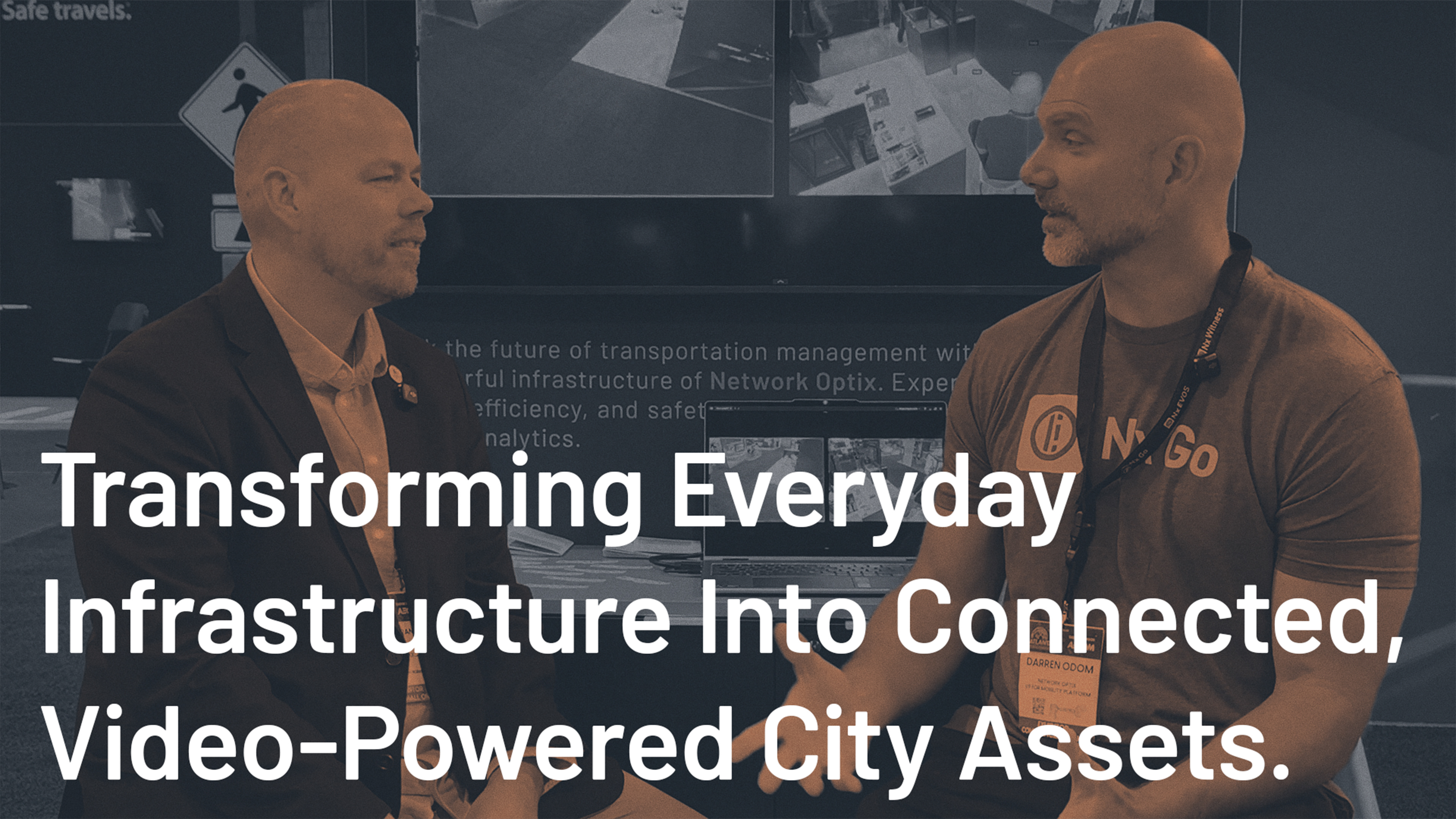
Externally, the system made a strong first impression. At the first major trade show debuting the new branding, attendees consistently commented on how distinctive and confident the brand felt within a visually conservative category.
Operationally, the new system reduced friction. Assets were easier to identify, maintain, and extend. A formal brand manual was created, and I led internal sessions to walk teams through the logic, answer questions, and ensure the system could be applied independently.
Culturally, the work elevated how Network Optix showed up alongside partners and customers — aligning the visual identity with the level of sophistication expected when working with top-tier technology and enterprise organizations.
Most brands look generic because they’re afraid to commit to a real identity. I build brand systems with a pulse, identities designed to scale, endure, and refuse to disappear into the noise.


Color System
Typography
Typography was treated as a stabilizing layer within the system — designed for clarity, consistency, and long-term durability across product, marketing, and technical communication.
A single primary typeface was selected to unify the brand across digital and print surfaces, ensuring familiarity and legibility at scale. Weight usage was intentionally limited to reinforce hierarchy without introducing unnecessary variation, allowing typography to support complex information rather than compete with it.
A secondary monospaced typeface was introduced selectively to differentiate functional elements such as subheadings and links, reinforcing structure and technical context while maintaining overall cohesion. Decorative treatments were deliberately avoided to preserve readability and credibility, particularly in dense or information-heavy environments.
The result is a typographic system that fades into the background when needed and asserts structure when necessary — supporting the brand through consistency rather than expression for its own sake.
The Brand in Practice.
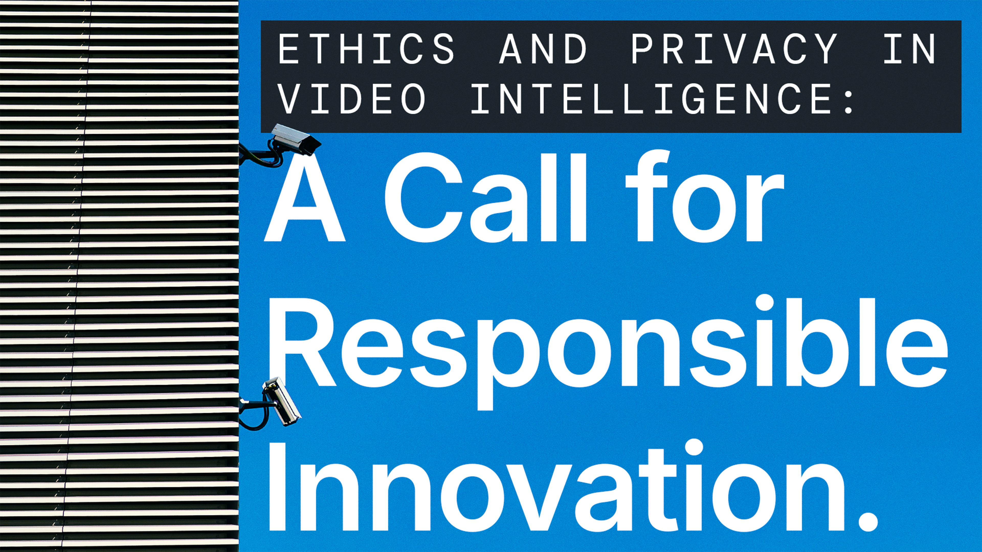
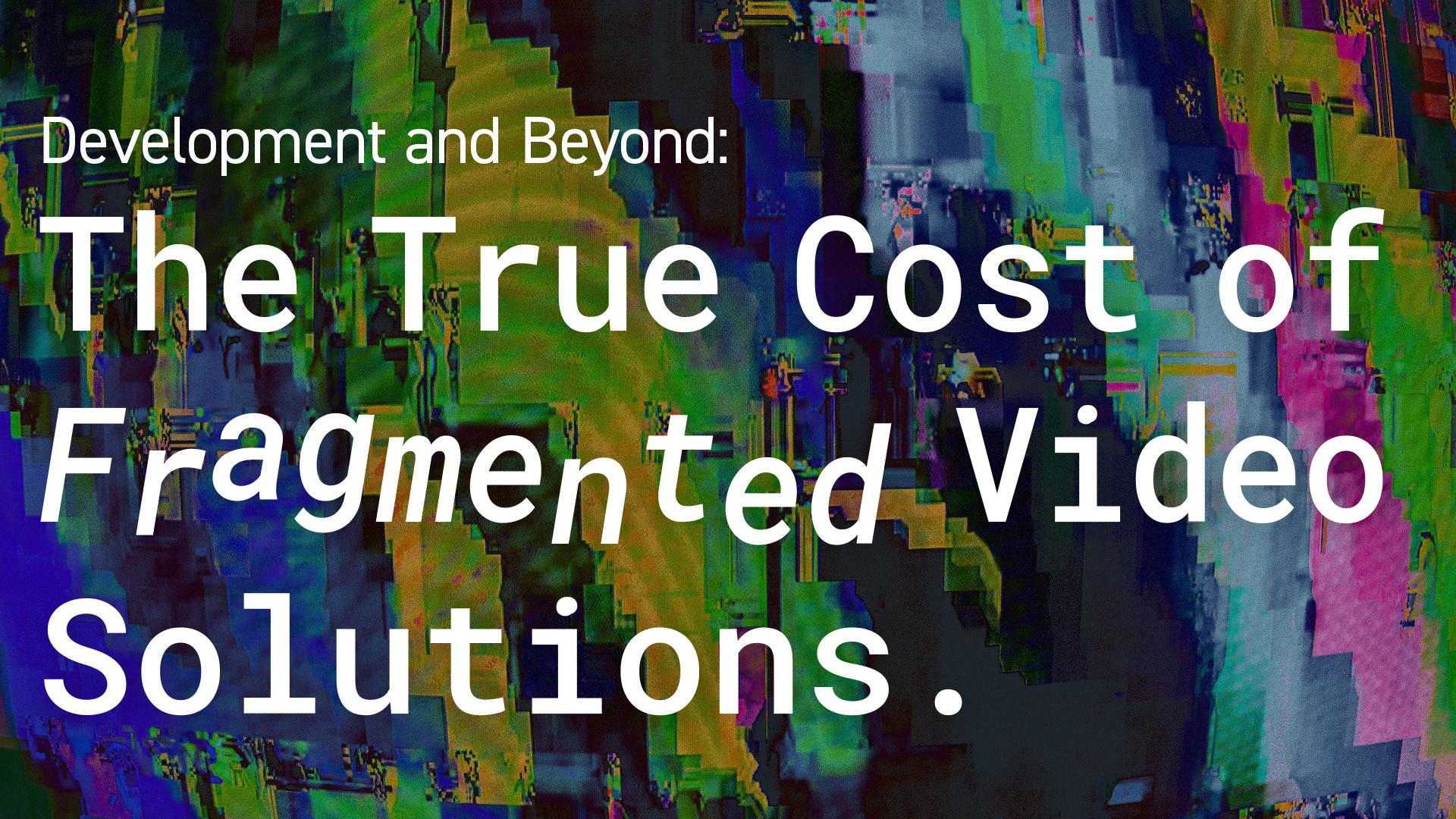
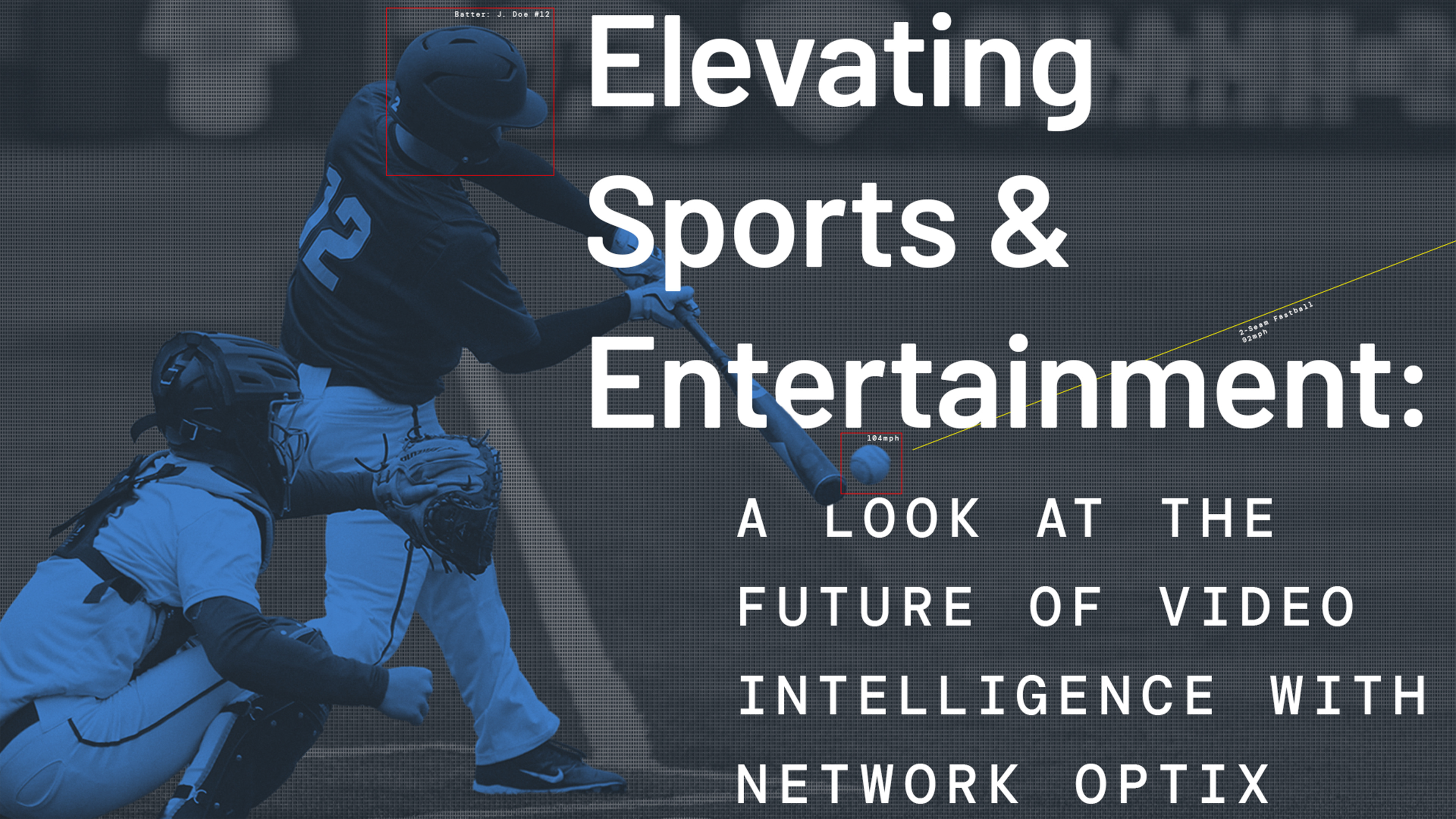
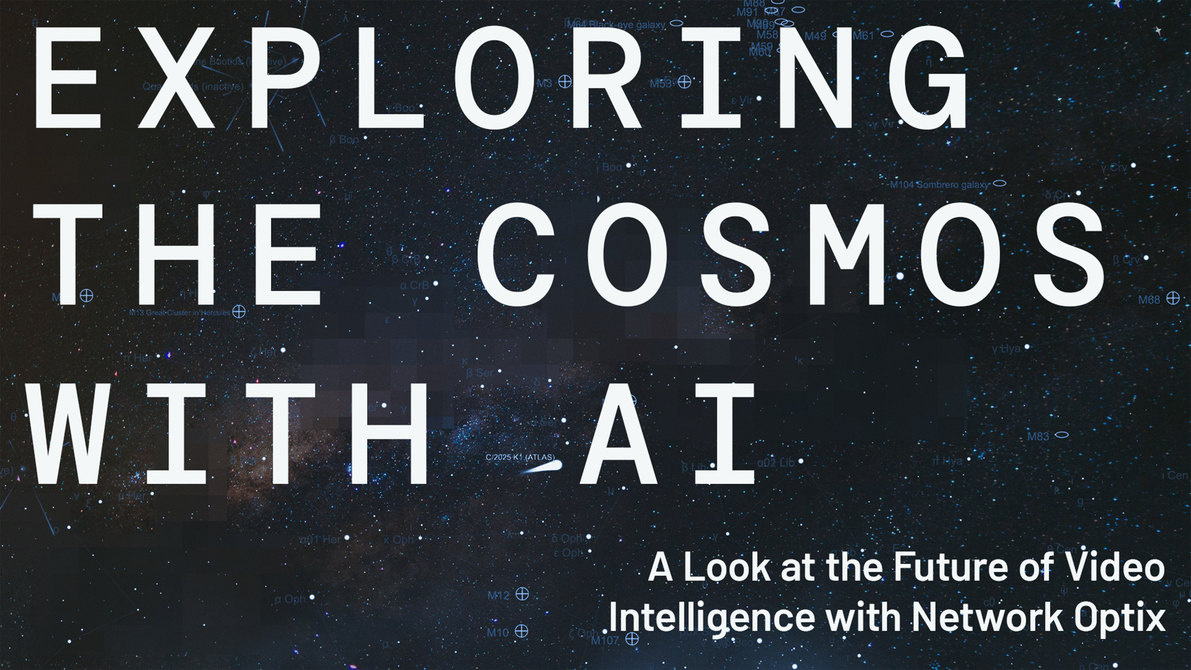
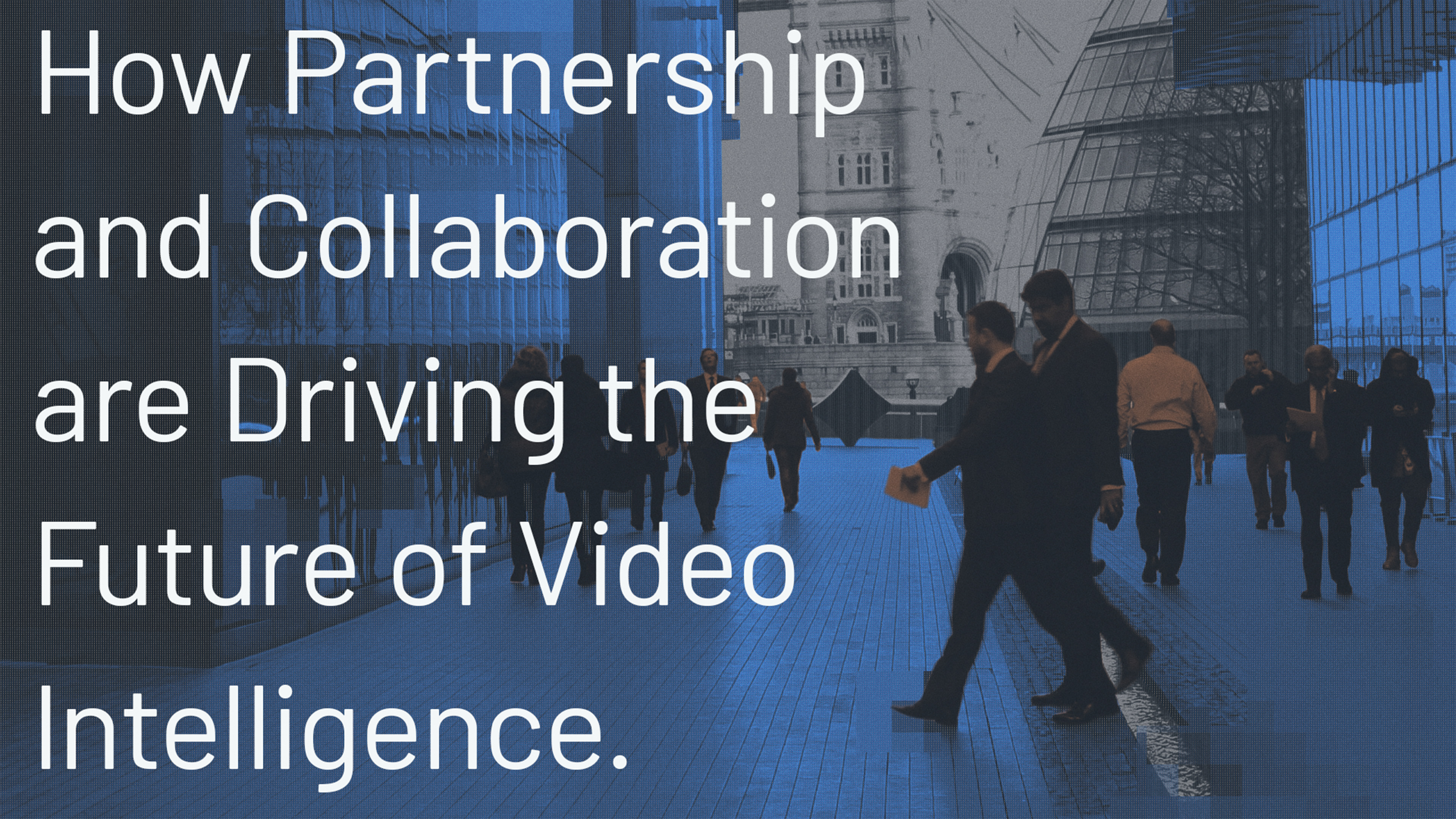
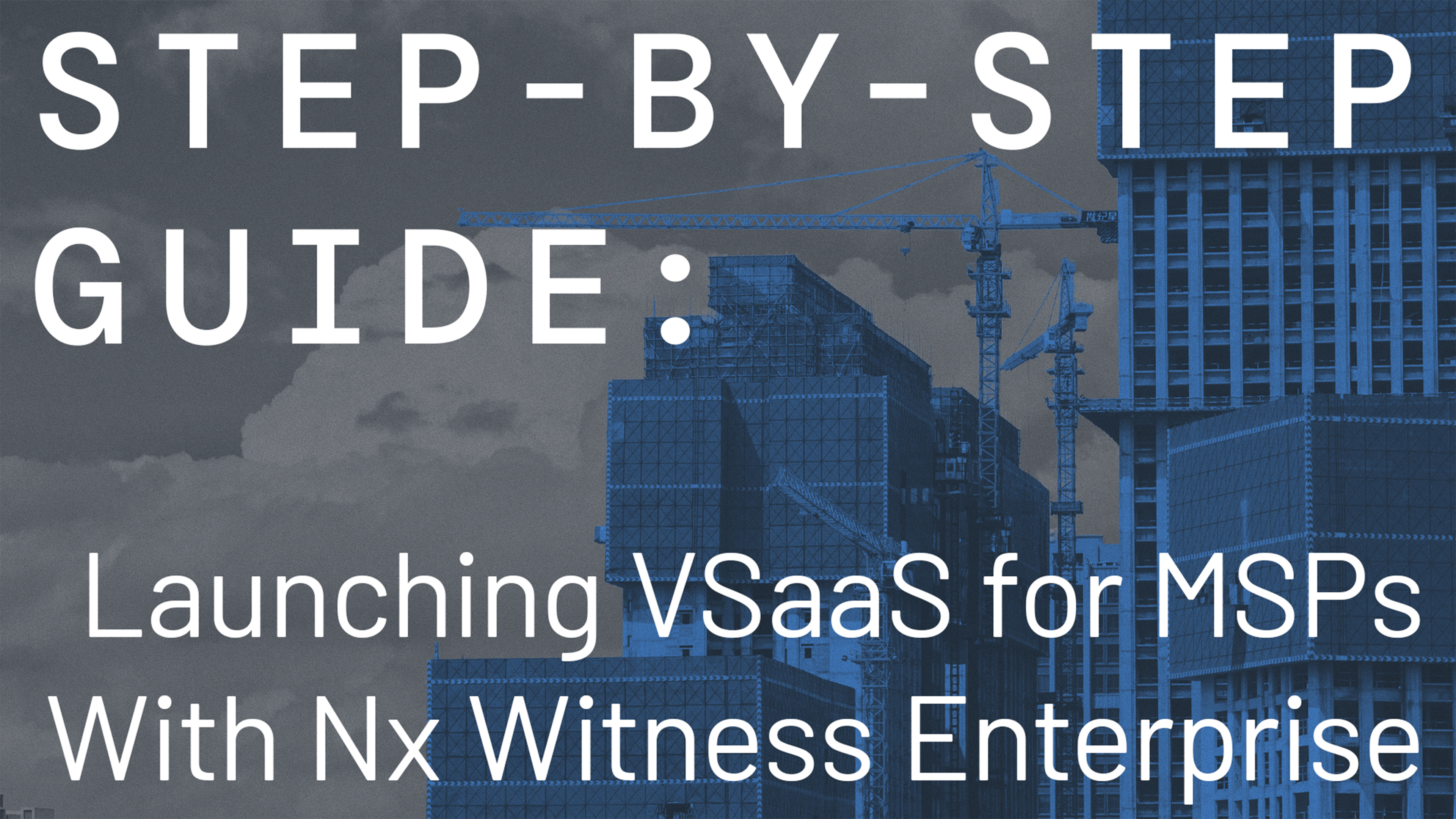
Editorial
Editorial content was treated as a long-form extension of the brand system rather than a separate design language. The goal was to create clarity and consistency across articles, thought leadership, and product narratives, while allowing enough flexibility for subject matter to lead.
The core system remained intact — shared tonal foundations, product-defining color accents, and restrained typography — ensuring editorial content felt immediately recognizable as Network Optix regardless of topic or platform. Visual hierarchy and pacing were designed to support complex ideas without visual clutter, keeping the brand confident and legible rather than decorative.
As a result, editorial pieces could scale across channels and audiences while maintaining coherence, reinforcing the brand through repetition rather than reinvention.


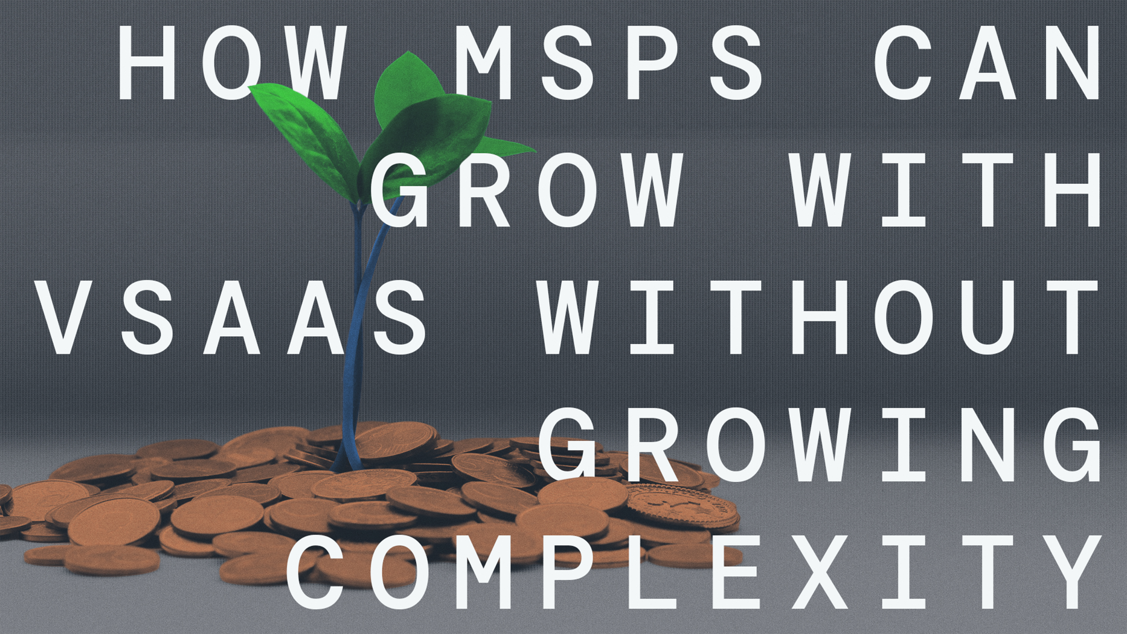

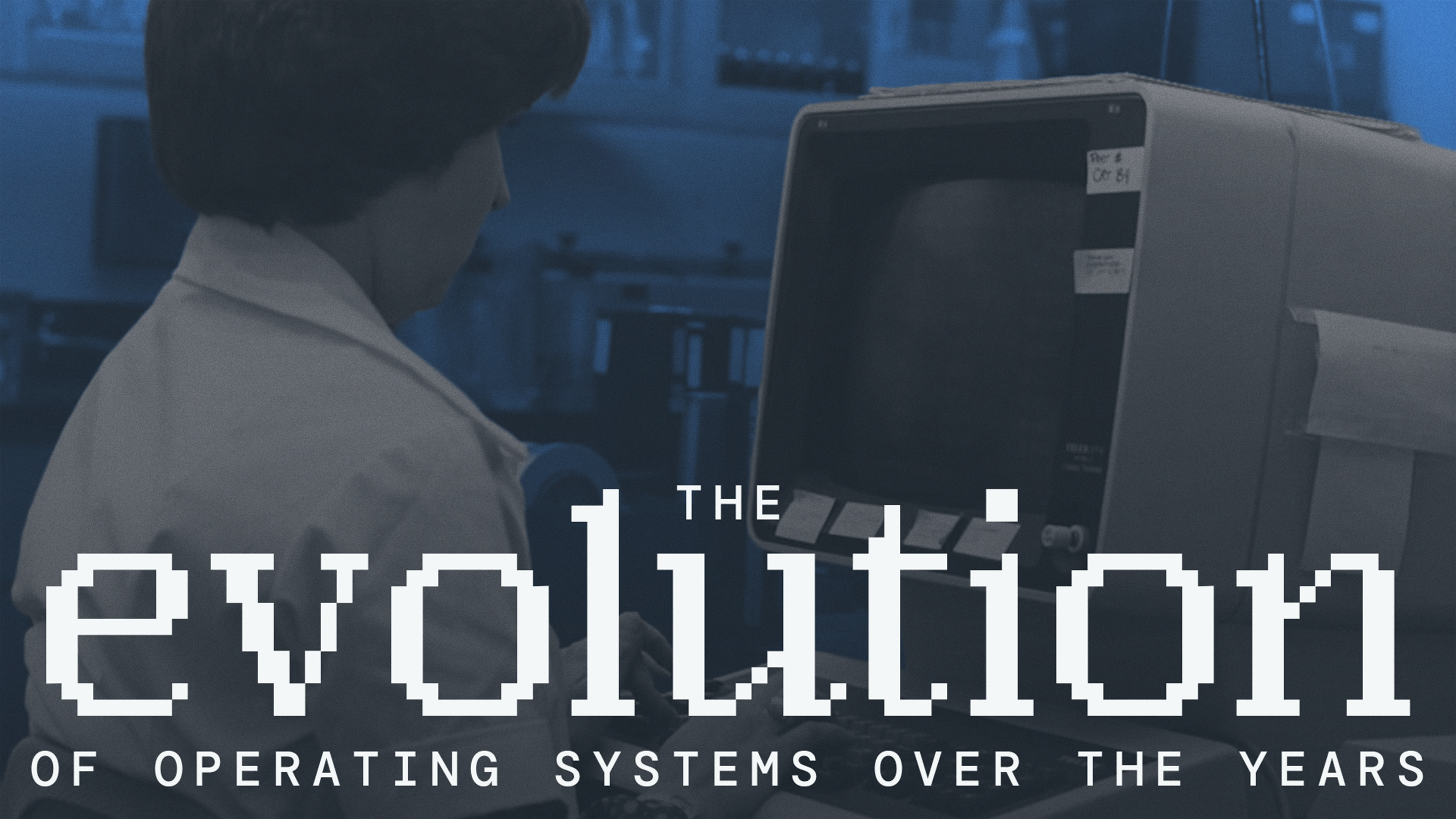


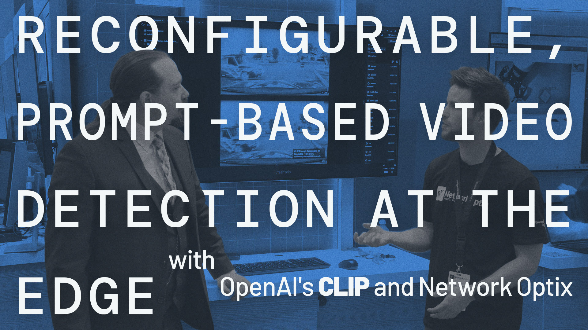
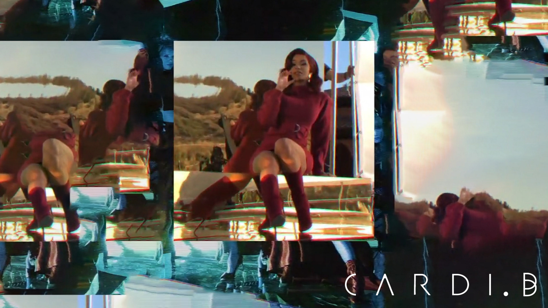
Youtube Thumbnails
YouTube thumbnails required the system to perform under entirely different constraints — speed, attention, and extreme compression — without losing brand integrity.
Rather than defaulting to exaggerated expressions or trend-driven visual noise, thumbnails relied on bold composition, disciplined color use, and strong product attribution. The same product-specific color logic allowed thumbnails to be instantly identifiable at a glance, even when viewed out of context or alongside competitive content.
This approach ensured consistency across video content while still competing effectively in a crowded feed — reinforcing recognition without sacrificing credibility.